- Home
- About Us
- The Team / Contact Us
- Books and Resources
- Privacy Policy
- Nonprofit Employer of Choice Award

 I love free stuff. So it should come as no surprise to anybody that I don’t like paying for software. There are a lot of non-profits out there doing great work and today I want to share with you some tidbits about the great free software that I know and love. I hope to motivate at least some of you to consider my suggestions, instead of forking over your money unnecessarily.
Let’s start with your Operating System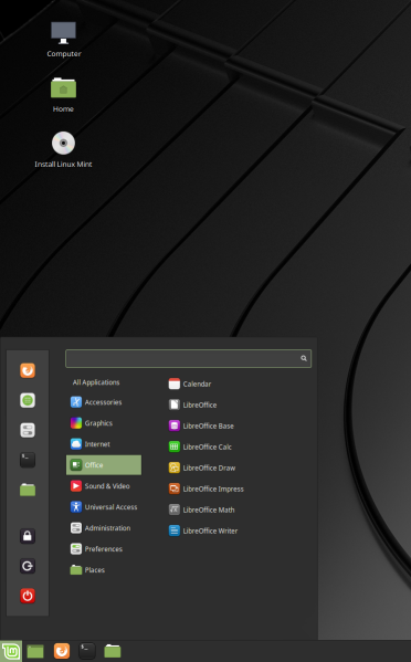
If you purchase a computer that comes with an operating system pre-installed, this is a moot point. However, what if you’re starting up a non-profit and need to purchase older machinery but still need good performance out of your computer. In that case, I really hope you consider Linux Mint. This is a free operating system that I use for tasks ranging from simple office tasks to much more complicated data science stuff. It’s simple. In fact, so simple that my seven and a half year old daughter uses it without ever needing to ask me for help.
Read more: https://linuxmint.com/
About that Office Software
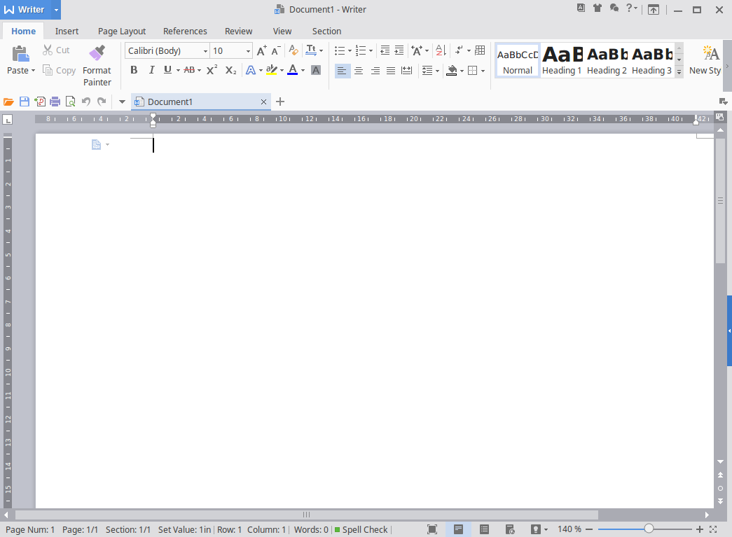
Yup, I’ve got a drop-in replacement for MS Word, Powerpoint and Excel. They’re called WPS Writer, Presentation, and Spreadsheets. They’re designed to look almost exactly like their MS counterparts and let me tell you they work VERY well. I prepared my last APRA presentation using WPS Presentation and I found it very helpful and effective to use.
Read more: https://www.wps.com/office
Here’s one for the Graphic Designers
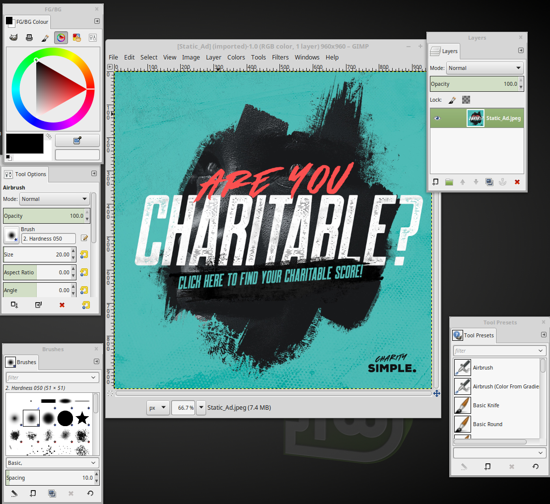
Need to modify or design graphics for your next campaign? Then two programs named “GIMP” and “Inkscape” have you covered. The first is a kind of a Photoshop replacement, whereas the second is a vector graphics editor. These are not for the faint of heart, but if you’re looking into them it means you have someone on staff who has the graphic design expertise to use them.
Read more: https://www.gimp.org/
I wouldn’t leave out my favs, the Data Nerds!
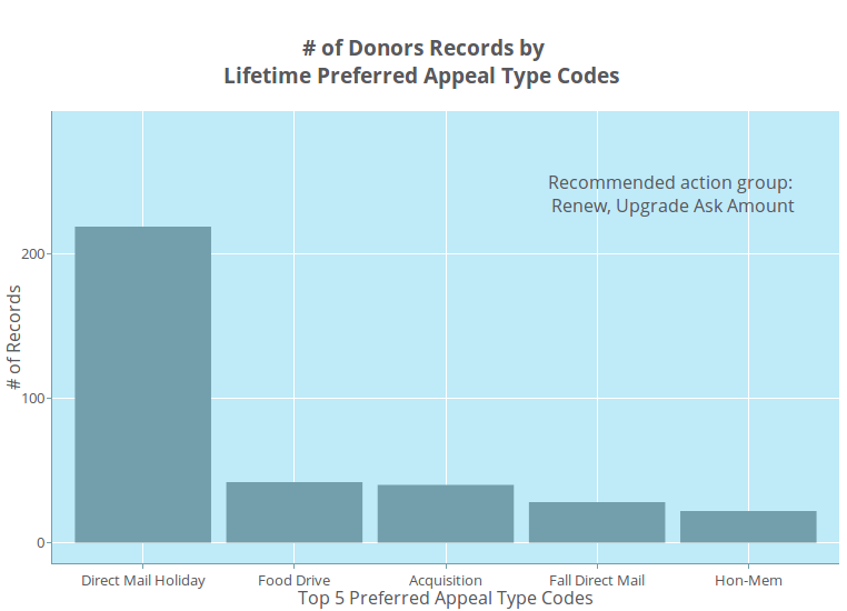 Employ an analytical person? Don’t worry about software fees here either! Firstly, there’s my analytical favourite, a statistical computing language called R. I do ALL of my analytics using it, and I even used it to build my web applications. Not only can it do almost any analysis, but it makes very pretty plots as well.
I did mention that R is a language. If people need point and click interfaces, I’ve got two alternatives for you to consider: PSPP (an SPSS replacement) and JASP. Both should cover a wide enough variety of non-profit use cases to be all you need.
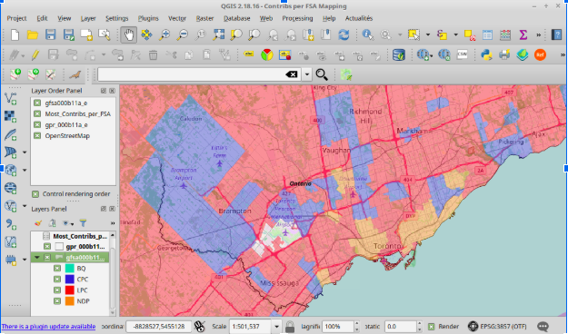
Also, QGIS will help you plot data related to geography on a map so you can see people trends across places.
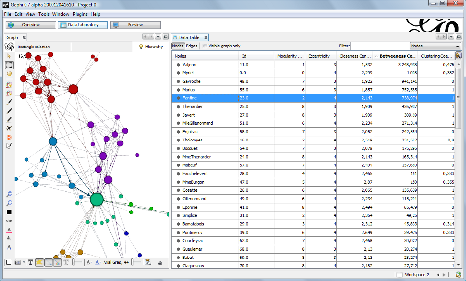
Finally, for prospect researchers who want to plot out social connections, please consider GEPHI!
Read more: https://cengel.github.io/R-intro/
https://www.gnu.org/software/pspp/
https://jasp-stats.org/
https://qgis.org/en/site/
Matthew Dubins is Chief Donor Scientist at Donor Science Consulting: a truly Canadian consulting agency using predictive analytics, data visualization, dashboarding, and address correction to help you do better fundraising with the help of your data! You can reach him at matt.dubins@donorscience.ca.