.jpg) Is your donation page optimized? While I don’t know your specific page, I can confidently say no because every donation page can be optimized. Whether it’s a big thing — like being clear with what a donation will do — or a small thing — like removing distracting links from your page — it can add up to a big difference.
Is your donation page optimized? While I don’t know your specific page, I can confidently say no because every donation page can be optimized. Whether it’s a big thing — like being clear with what a donation will do — or a small thing — like removing distracting links from your page — it can add up to a big difference.
For example, is your donation page secure? Most likely. But do your donors know it is? Perhaps not. Take this experiment, for example, where the organization added a shaded treatment to the Credit Card information area — where donors are most sensitive to security issues — and added a little 'lockbox' icon to reinforce, visually, that their information was secure.
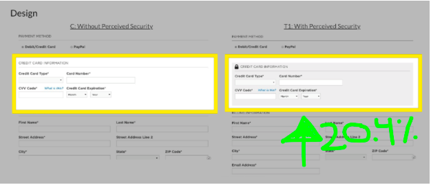
The end result? A 20.4% increase in conversion rate.
And that’s just one minor change in one area of a donation page. As a fundraising research lab, I get to spend a lot of time looking at examples and experiments as does our Sr. Director of Research and Education, Jon Powell. After looking at over 400 different donation page experiments, he actually found that there were 19 main areas of a general donation page that you can change, tweak, and experiment with. Here’s the short summary:
Happy testing and good luck!
Brady Josephson is a charity nerd, entrepreneur, digital marketer, professor, and writer. He’s on a mission to see more people giving and more causes thriving. At NextAfter, Brady focuses on business development and partnerships, content creation, and marketing.
For information on how you can improve your donation page and and where do you get started? Three suggestions for you:
You can see all the research that went into these 19 areas and get a free guide with more info on each area here: https://www.nextafter.com/interactive-donation/.
You can take a free online course on Donation & Landing Page Optimization here: https://courses.nextafter.com/register/donation-landing-page-optimization/
You can attend an in-person certification training workshop coming up near you, check here: https://www.nextafter.com/training