 During the last American Presidential campaign, Paula Atfield and Philip King took a look at the American candidate websites and offered their thoughts on what was effective for each party including what charities can learn. Inspired by their effort, here is the Hilborn Charity eNews look at the four major parties and what fundraising lessons you can learn.
Big photos make big impact
Every site has a single large photo. While it can be tough to choose a single image to capture what a political party wants to convey, it is also visually powerful. If your charity has more than one large photo on your landing page, you need to ask yourself if you are having the impact you want on potential donors.
Giving is fast
The gift processing is very similar for all four parties and super easy. Honestly, you can fill in a donation form in about 30 seconds. That is an industry standard for how long it should take to make an online donation. Set your timer and see how long it takes you to make a donation to your charity. If it takes more than 60 seconds, start asking questions to find out why and find solutions to speed the process up.
Language is easy to find
For all four parties, you can easily navigate to either the French or English page. This is valuable for organizations who serve more than one constituency.
Party by party - insights and questions
Below are the landing pages for each of Canada's four major parties. Each has it's own differences for you to consider.
Conservative Party of Canada
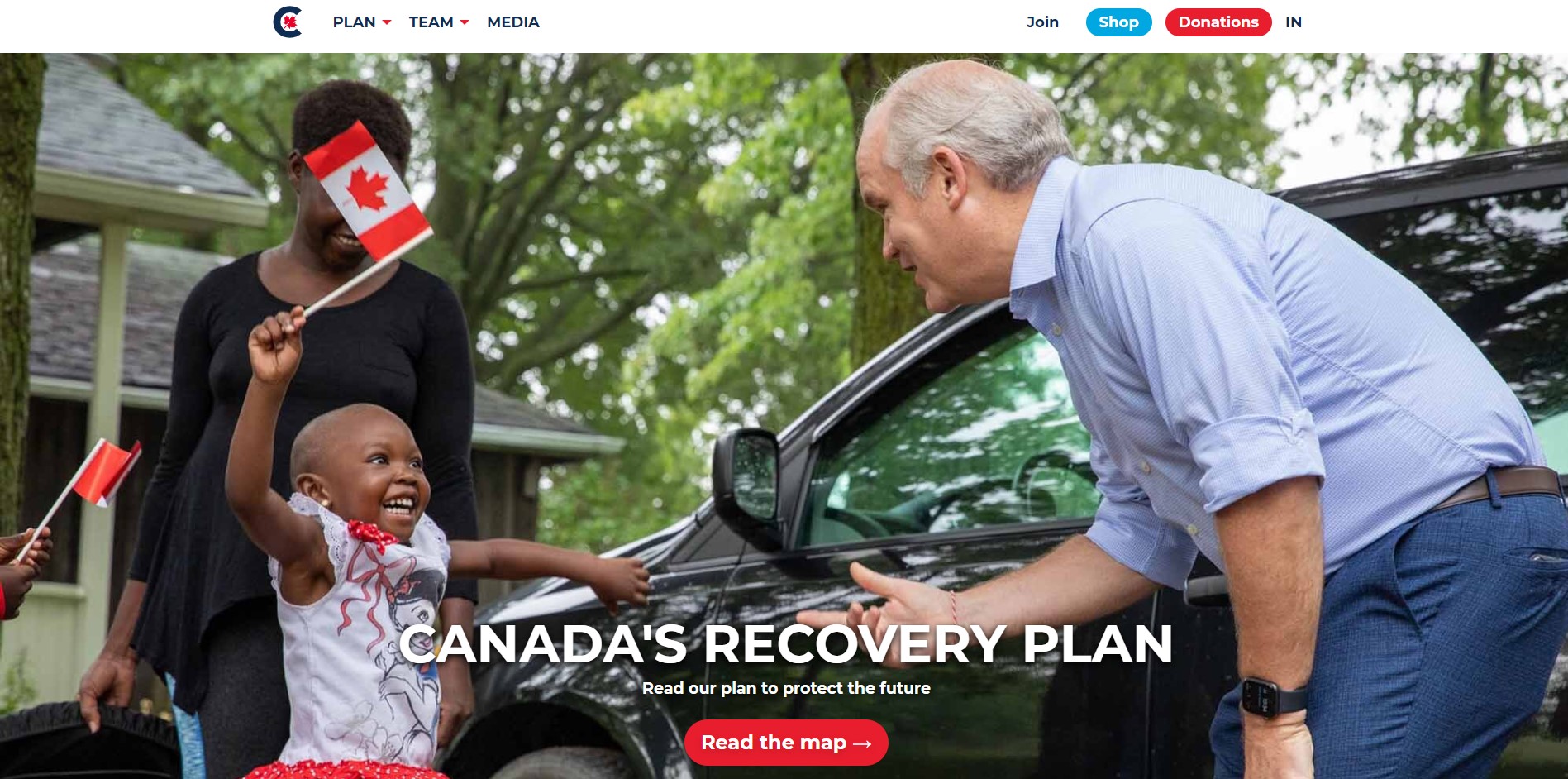
From a fundraising perspective, I question having two highlighted buttons at the top of the page - one for "Shop" and one for "Donate." Generally, it is better to have one highlighted action at the top, not two. You want your site to drive people to the one action you want most. There is a second place to Pitch in lower down on the page which is valuable because it gives folks a second chance to make their gift.
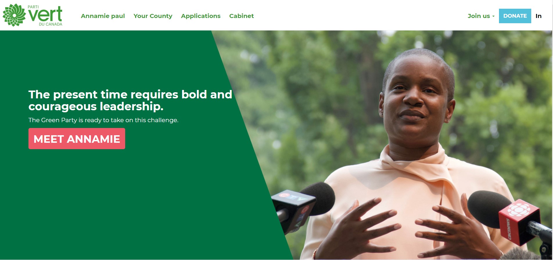
Green Party of Canada
From a fundraising perspective, the single, solid Donate button jumps out from the upper navigation bar. It is clear. There is a button lower on the page that invites you to meet Green leader Annamie but your eye will see the donate button first. There is a second opportunity to donate at the bottom of the page which gives viewers another place to make a gift.
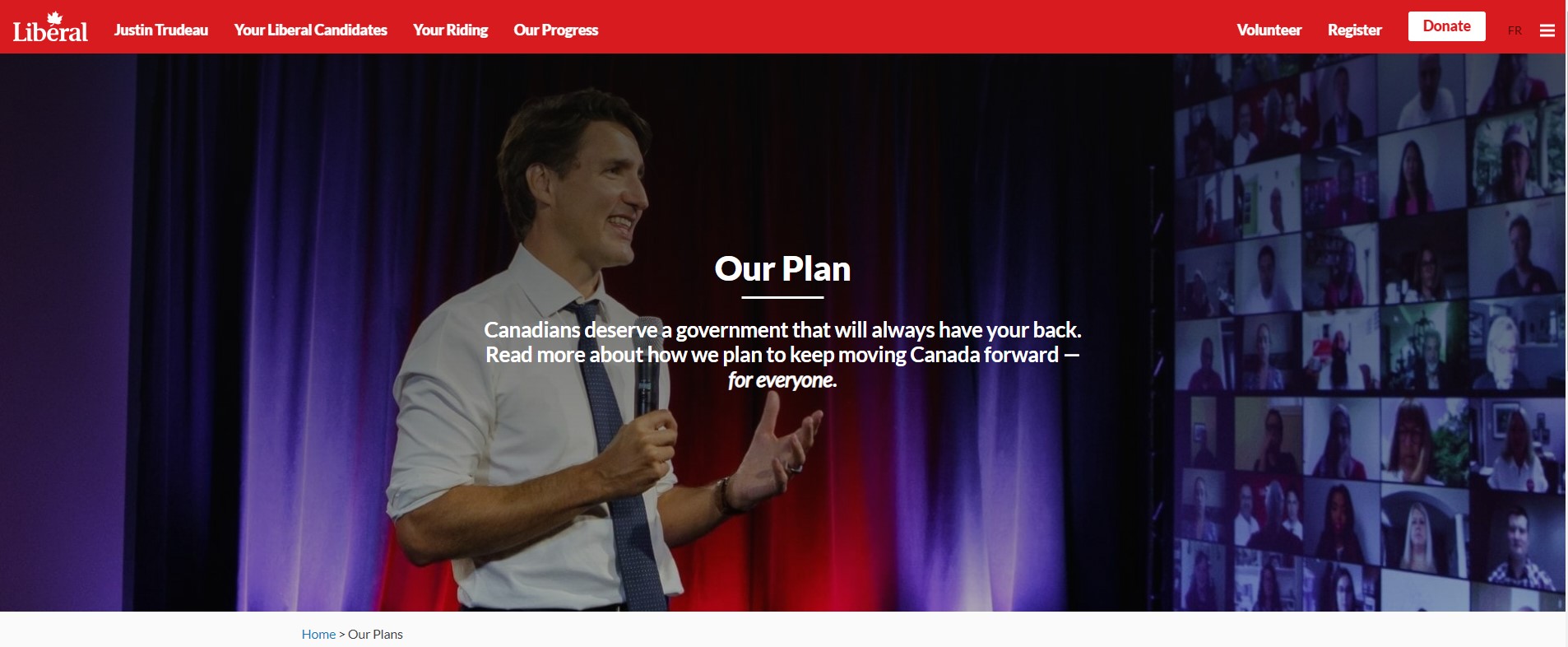
Liberal Party of Canada
From a fundraising perspective, the single, contracting Donate button makes it clear what action is wanted. There is more on the upper navigation bar, but the Donate is the only highlighted one. The Liberals are the only party that do not have a second place on their landing page to make a gift when you scroll down. This seems like a missed opportunity.
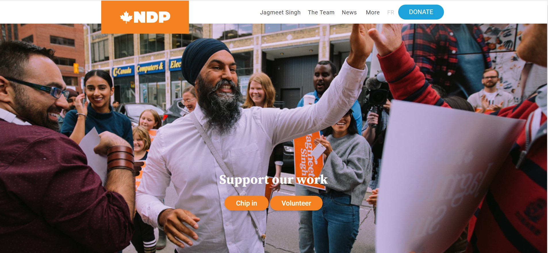
Canada's NDP
From a fundraising perspective, this may be the strongest landing page. It has the single, highlighted Donate button at the upper navigation bar. However, it also has a second opportunity to "Chip in" further down on the page. By having two places that ask for a donation, the NDP is optimizing their chances of receiving a gift.
Editor's note - this is an overview of political party fundraising websites viewed on a desktop on August 17, 2021. The editor is expressing no view about which party you should vote for. But please do vote.
Ann Rosenfield is the editor of Hilborn Charity eNews, a card carrying Democratic, and tax paying Canadian permanent resident.