 I recently had the pleasure of attending a talk on good donor communications. During the talk, someone asked about split testing aspects of a direct mail letter at a small charity, and what kind of advice could be given on the matter. (Very briefly, split testing is the practice of creating 2+ versions of a letter, each going to a different random portion of your donors.)
I have a pretty unshakable belief that there’s always a reason and opportunity to do testing, unless you have maybe a handful of donors. I followed up with the speaker on this topic, and she believes that cash/time strapped charities can use well established results to alter several aspects of a direct mail letter without more testing. Later, perhaps when they’ve had reasonably good success in their DM campaigns, then she feels testing has a place.
In general, only big charities will probably have enough donors to test relatively minor things, such as font size. Smaller charities can still test the major stuff. I want to share some of her recommendations and explain why it still makes sense to do testing:
Font Size
She didn’t mention what font size was best, but according to Agents of Good, the answer is “as big as possible”. How big is too big? Is 18 point comically large? Is 12 point too small? The point is that you don’t know, and so instead of guessing you should choose a portion of your donors to receive bigger text, and another portion to receive smaller text.
Which letter version led to a higher rate of response? Once at least 3 months have passed after mailing your letter, visit my A/B Test Calculator, punch in your results, and it will tell you if one version was statistically higher than the other.
Using a Coloured BRE
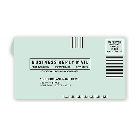
This recommendation is very sensible. We receive so many white pieces of mail, that getting a coloured piece of mail is visually attractive, and perhaps even relieving. Also, the fact that the donor doesn’t have to pay for postage increases the chance that they’ll donate!
Here’s a silly question: what colour should your BRE be? Green, like in this picture? Pink? Yellow? Orange, White with stripes? The list kind of goes on! Yet again, you can’t begin to know what works best for your donors until you test! Green against white, or yellow against orange, etc.
Letter Length
How many pages should the letter be?In general, it seems common sense that you shouldn’t keep shrinking font size so that you can keep the letter in 1 page.
Many page letters aren’t necessarily a bad thing, but it all depends on the topic and the execution. Testing would help here too :)
“Thank you for caring”
Thanking your donors is always GREAT advice! How effusive, or sparing, should you be with your thanks though? Testing testing, 1,2,3!
Matthew Dubins is Chief Donor Scientist at Donor Science Consulting: a truly Canadian consulting agency using predictive analytics, data visualization, dashboarding, and address correction to help you do better fundraising with the help of your data! You can reach him at matt.dubins@donorscience.ca.