- Home
- About Us
- The Team / Contact Us
- Books and Resources
- Privacy Policy
- Nonprofit Employer of Choice Award

 When I think about the tough conditions under which non-profits operate, I can’t help but think of the song “Under Pressure” by Queen and David Bowie. With so many charities operating in similar spaces, it’s inevitable that they will face the pressure of having to compete for the attention of their donors.
If you want a chance at success, pay attention to your donor data! You will make better decisions, waste less money, and will worry less about closing up shop.
If the word ‘data’ stresses you out, then never fear! Data visualization (aka graphs/charts) is a stupendously infectious way of staying on top of your charity’s operations and helping all involved make the best decisions possible.
In this article I’m going to present a survey of the different types of graphs, along with their value to your charity, as well as some caveats.
The Simple Bar Graph

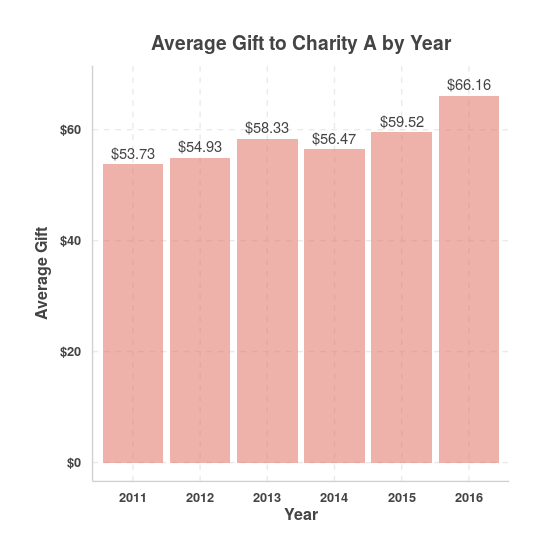
Bar graphs are hugely useful in data visualization. Here I’ve graphed the average gift given to a particular charity each year from 2011 through to 2016.
Benefits: Bar graphs let you see trends and compare quantities accurately and quickly. Here you can see that there was a slow increase in average gift from 2011 to 2016. Great news, right?
Caveats: Don’t get too excited over the rise or fall of your measurement variable between 2 years. It might be random or unduly biased by fringe cases. Average gifts are especially susceptible to this!
As with any graph using height, be sure that the vertical axis starts with zero.
The Stacked Bar Graph

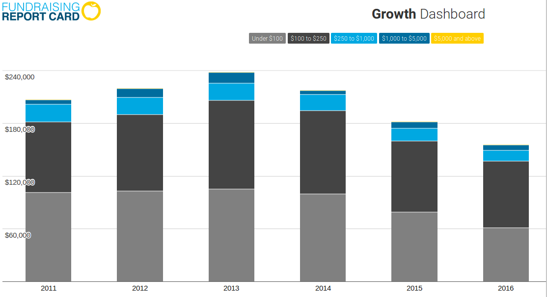
Remember my caveat above about the simple bar graph? Here’s data from the same charity, where donation totals each year are broken out and stacked according to how big each donation is (the colours are the levels). Accordingly, you can see that donation dollars from the lowest level (under $100) have actually declined since 2013, whereas the higher level donations have thankfully been staying steady. This would explain why the average gift has been going up over the years!
Benefits: This graph gives you more information about your charity’s fundraising performance each year and is less susceptible to bias. In this case, the charity can choose to beef up its direct mail program, or invest very heavily in major gift fundraising!
Caveats: In general, beware using too many colours in a stacked bar graph.
In part two, Matthew will show the benefits and caveats of line graph, interactive dashboard, and donor cohort graph.
Matthew Dubins is Chief Donor Scientist at Donor Science Consulting: a truly Canadian consulting agency using predictive analytics, data visualization, dashboarding, and address correction to help you do better fundraising with the help of your data! You can reach him at matt.dubins@donorscience.ca.