- Home
- About Us
- The Team / Contact Us
- Books and Resources
- Privacy Policy
- Nonprofit Employer of Choice Award

 If you want a chance at success, pay attention to your donor data! You will make better decisions, waste less money, and will worry less about closing up shop. Part one showed the benefits and caveats for The Simple Bar Graph and The Stacked Bar Graph. Part two shows three more options.
The Line Graph

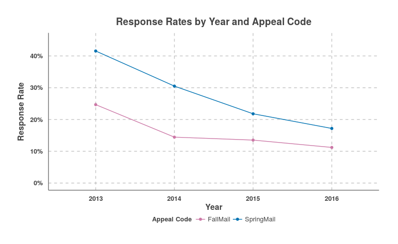
Out of everyone you solicited in an appeal, what percent of donors responded with a donation? That’s what this graph answers. Appeal is the colour variable, and response rate is the measurement variable.
As you can see so VERY easily, the charity had a lower response rate for its Fall and Spring mailings with each passing year from 2013. Why keep spending money soliciting non-responders? Time to rethink your strategy if your charity’s graph looks like this!
Benefits: You can easily compare a handful of trends affecting your charity’s performance over the years.
Caveats: For clarity, don’t compare too many trends.
The Interactive Dashboard

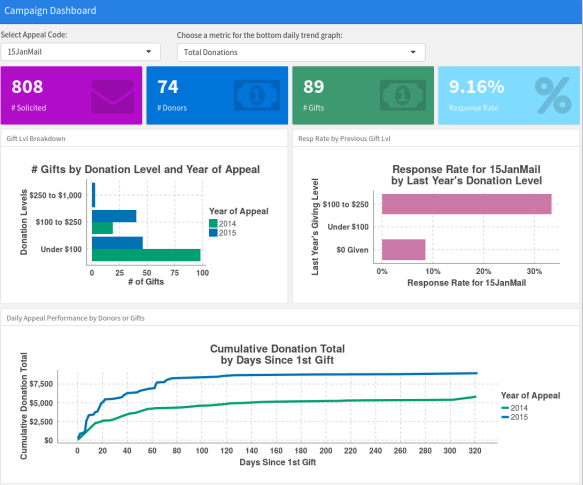
Here’s where things get really cool. In an interactive dashboard the idea is to combine numerous graphs into a web-based collage, giving you all the information you need in one screen. In the example above, the user can select a fundraising appeal using a drop down menu at the top left, revealing all the relevant information below, and even change the bottom graph from cumulative donations to # donors or # gifts.
Benefits:
Accessibility of clarity of the data underpinning a charity’s performance and operation.
Caveats: Don’t stick too much stuff on one dashboard or it will be visually jarring. Also, you can’t simply do this in your spreadsheet program!
Donor Cohort Graph

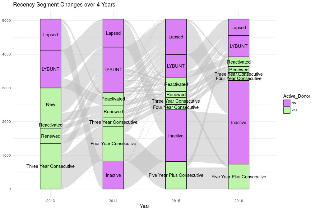
The above beauty is my own adaptation. I call this a donor cohort graph. The idea is to take a cohort of active donors from any past year of your charity’s operation, slot them into boxed subgroups and then follow how these same people flowed in and out of those subgroups year after year.
The boxes are taller or shorter depending on the number of people in a subgroup in a given year. Also, the ribbons between the boxes are thicker or thinner depending on the number of people flowing in and out of subgroups.
Above we see an alarming number of people flowing into the “LYBUNT” category especially from 2013 to 2014. We also see that if you’re going to reactivate, it tends to be when you’re “LYBUNT,” and not lapsed! Also, just look at what happened to the majority of the “New” donors after 2013. Not good!!
Benefits: You obtain very realistic expectations about your donors’ behaviours over the years through this kind of tracking. This will spur you into action!
Caveat: This graph gets messy with too many subgroups. Also, the complexity of the graph might slow down the time it takes to derive insights out of it.
Conclusion
This article series was not able to cover everything, but I hope that I was able to get you excited about data visualization. If you manage to integrate data visualization into your charity’s regular operations, I guarantee that you will be feeling less pressure and will end your fiscal year singing “We are the champions, my friends.”
Matthew Dubins is Chief Donor Scientist at Donor Science Consulting: a truly Canadian consulting agency using predictive analytics, data visualization, dashboarding, and address correction to help you do better fundraising with the help of your data! You can reach him at matt.dubins@donorscience.ca.